Resident Onboarding

Making the Most of Limited Time

Background

After graduating from medical school, resident physicians spend three to seven years in graduate medical education. During this period, they rotate through a number of different settings, including hospitals and outpatient clinics, providing patient care under the supervision of attending physicians. Denver Health welcomes roughly 250 residents each July, speeding them through a hospital orientation including everything from N95 mask fitting and drug testing to basic hospital policies. While some residents start their rotation at Denver Health immediately after orientation, many head to other hospitals and don’t return for months.

When I joined Denver Health, orientation did not include any orientation to Epic, the electronic health record software they’d be using each day. We relied on another hospital to do this, taking just five minutes of our orientation to confirm the residents’ login credentials worked. This plan ignored a major challenge for residents: different hospitals use slightly different versions of the software. Residents moving between hospitals would find themselves unable to find an important medication or struggling to locate key information because of a simple difference in naming conventions. Little delays added up, and it was common for residents to spend hours at the end of their shifts finishing up documentation. Because of their constantly shifting schedules and crushing workloads, residents were also notoriously difficult to educate about Epic.

Purpose

Despite its shortcomings when I started, I saw that orientation had potential. Orientation was a chance to make a face to face connection with the residents and gain trust by doing something valuable for them. If their first interaction with Epic training was successful, maybe they’d be more receptive in the future. There had to be something we could do in limited time that would set them up for success.  

Process

Year 1​

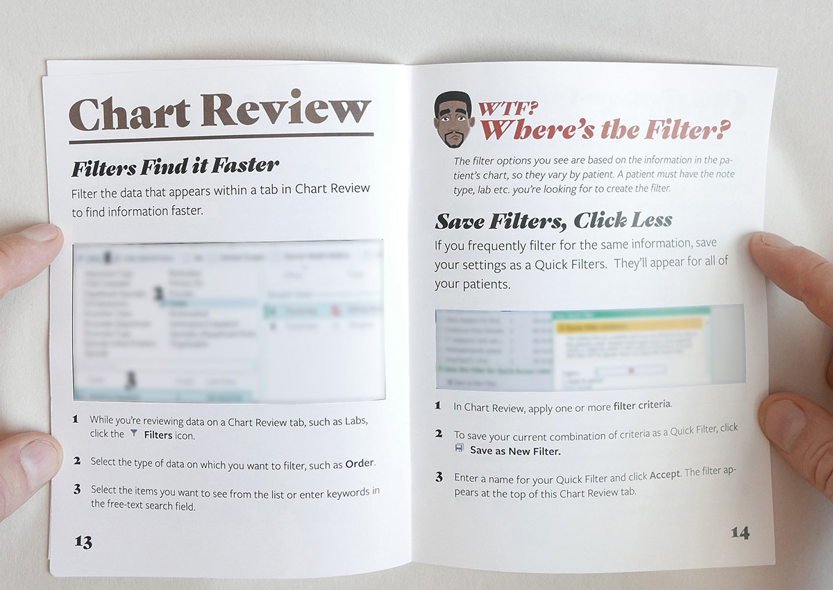
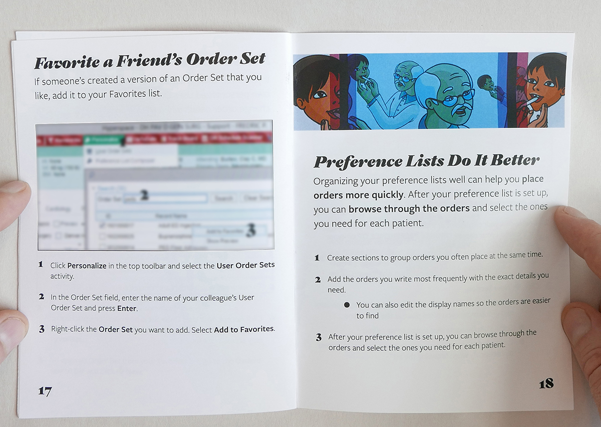
After speaking with residents and attendings, and considering the parts of our new hire training that had the most immediate impact, I decided that I should focus on personalization. Users can save significant time by create groups of commonly ordered medications that can be placed with just a few clicks and templates for their notes that require only minor editing before completion.

The orientation organizers were initially reluctant to provide the Epic team with any more time, but I submitted a proposal for the Chief Education Officer that outlined the problems caused by residents having insufficient training and how spending time on personalization could help. I was given ten minutes instead of five which felt like a major victory at the time.

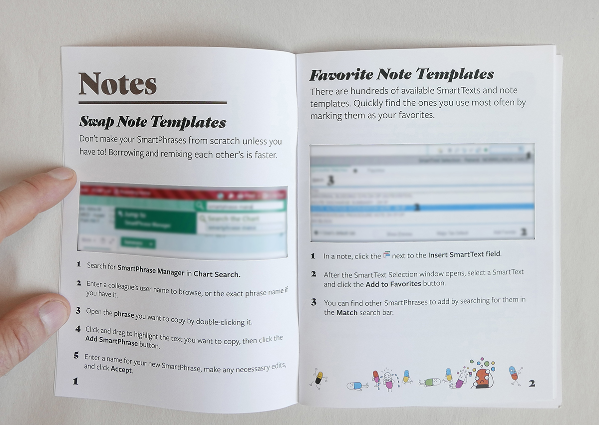
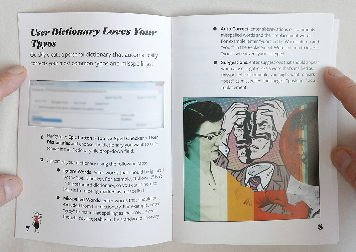
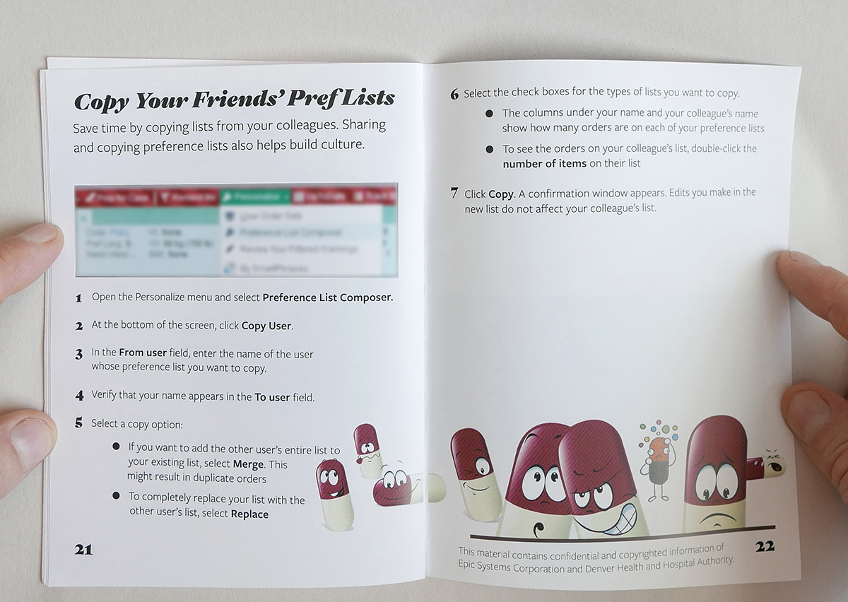
Working with clinicians in the three largest specialties, internal medicine, pediatrics, and general surgery, I compiled lists of the most useful orders and note templates. I made in-class materials organized by specialty, and because Epic allows users to share customization rather than each person having to make them themselves, I added every customization to my own user profile. The plan was for residents to use the print materials to learn which customization options would be useful for them, then copy those from my account.

When orientation finally came, the plan worked…almost perfectly. Residents rotated through in groups of 20, generally all from the same specialty, and in the first few sessions we had problems because the software didn’t allow more than one person to access a given note template at a time. It was a problem we’d never seen before, but my colleagues did a great job adapting. We circulated through the classroom guiding the residents to different sections of the curriculum and staggering the group’s process so that no two people were doing the same work at the same time. While this required more work on our part, for the users it was negligibly slower. Residents almost always completed their work in ten minutes, and for the handful that couldn’t, we had a lab where they could finish up while the next group started. There were bumps, but in their after-orientation surveys, 45% of the residents rated the Epic orientation as excellent, and another 33% rated it as good. We were clearly headed in the right direction.  

Year 2

With the success of the prior year, we easily convinced the orientation organizers to give us an additional half hour. With the extra time we could do even more customization and cover some efficiency tips. I knew there was important material we still wouldn’t have time for, though, and things that residents who wouldn’t be returning for weeks or months just wouldn’t retain. I had seen residents referencing various folded pieces of paper stuffed in their lab coat pockets, and I convinced my supervisor that we should make a pocket guide. 

While working with providers in various specialties to decide the content of the guide, I also spent time thinking about the theme. My initial idea was to do a clean, Swiss Style design with nothing to offend or distract from the content. I made a prototype, and it was functional but felt wrong. I thought about why. Despite its current image as a sparkling Mecca for craft brew and ski enthusiast millennials, Denver has a rougher, more violent history. People used to refer to the Denver Health emergency department as the Knife and Gun Club, and its insignia still depicts a crossed knife, gun, and hypodermic needle. We have some of the most skilled clinicians in the country helping undocumented immigrants and the homeless. Denver Health is a world class medical facility, but it’s also gritty, and there’s pride in that. I stopped listening to Bach and put on Run the Jewels. After studying I the provider personas I’d made, I started brainstorming what it means to be a resident at Denver Health and how the art and design should reflect that. Four core ideas emerged:

  • Becoming a resident at Denver Health is a crazy, harrowing, exhausting, exciting adventure and this guide should respect that and welcome residents into it. I wanted the art to be a little dark, but not too dark.
  • If I wanted resident to hold onto and return to this guide, it had to reward closer inspection. It should be more than simply functional and have surprising details that made it worth looking at more than once.
  • Our staff and patients are diverse, and any art I made for the guide needed to represent that.
  • I was not good at doing Swiss Style design, didn’t have time to get good, and should just get weird, which comes naturally to me.

With these ideas in mind, and a funky beat blasting in my headphones, I started playing around with 70s color palates and fonts. Louder design felt better. I designed the cover to look strange and intriguing, something instantly different from any other materials they’d see in the hospital. Resident workspaces are covered in black and white printouts and if I left a stack of pocket guides around I wanted them to pop. One of the most satisfying experiences as a designer is turning limitations into opportunities. I had access to a stock image site and my initial searches for photos and illustrations to use in the guide were not encouraging. The photos looked like…stock photos, and the illustrations were vapid. 

Making the guide was a manic, joyful process, but it wasn’t the only preparation for the orientation. I also expanded the number of specialties included in the classroom personalization guide and revised the existing customization suggestions based on feedback from users. To prevent the bottlenecks we’d experienced the year before, we made the customization process asynchronous so that residents wouldn’t be interacting with the same note templates at the same time. To habituate using the pocket guides, I also revised the in class materials so that they referred to different pages of the pocket guide for key instructions.

When orientation came, I sat in the classroom while residents filtered in and watched them react to the classroom materials and pocket guide that were waiting at their computers. The highlight was watching a resident pick up the pocket guide, read the introduction and then turn to her neighbor and say, “It’s like the read my mind.” The guides were a huge hit, more so than we even planned for. Because Epic can change significantly month to month, we’d only printed enough copies for resident who’d be starting immediately. By the end of the first day, we realized that many more residents than should have were taking copies home and we had to rush print replacements. The exit surveys also reflected how much we had improved. In 2018, 73% of the respondents rated our training as excellent and 22% rated it as good.

Year 3

By the third year, I felt confident with the in-class materials and facilitation. The pocket guide was well received, and I was proud of it, but I knew it could be better.  The information within it was good, but there wasn’t enough. I wanted to keep the guide quirky and surprising, but denser so residents would still be learning new things from it month after month. I also thought users would be more likely to hold onto it if the information in it wasn’t limited just to Epic.

For the new guide, I wanted the cover to clearly communicate usefulness by being useful itself. Working with users, I always made it clear that I knew Epic was my job, not theirs. Even though they interact with Epic constantly, I wanted them to have to think about it as little as possible. It should always be the background to the intellectual and relational work they were doing. I built trust by reflecting their values, and I wanted them to trust and value the guide because it did the same. I had met a resident who carried around a sheet of paper printed with important hospital phone numbers. She told me the list didn’t exist in any centralized location, but she referenced it constantly throughout her day. I decided to design the front and back covers of the pocket guide to just be these phone numbers. I added two simple graphics to indicate front and back, top and bottom, but no title.

Outcome

The intern orientations generally, and the pocket guides specifically, were incredibly well received. Clinical leadership and residents commented on the quality of the materials, and new copies printed throughout the year were always gratefully received. The guide is still in use today, distributed to all new residents as part of their orientation.