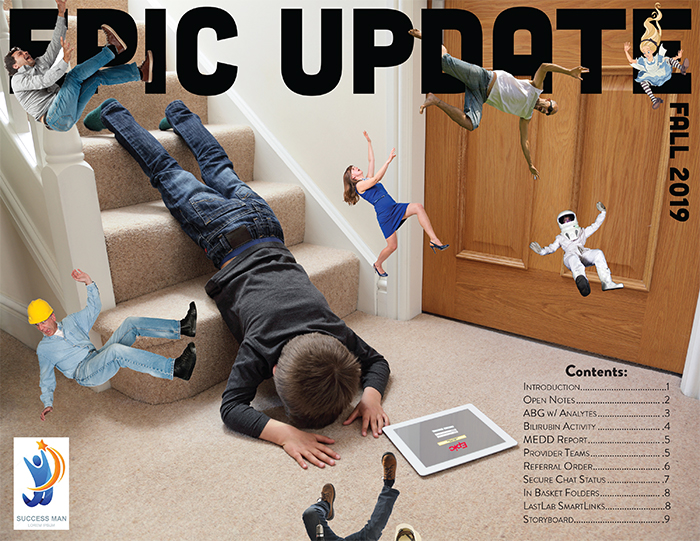
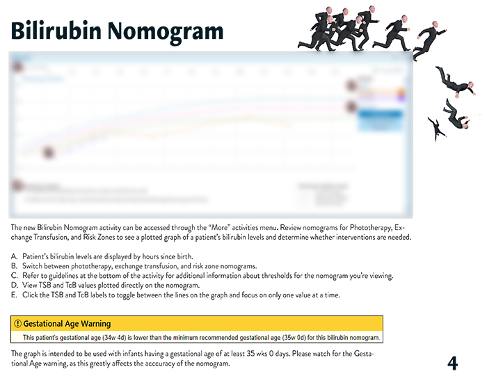
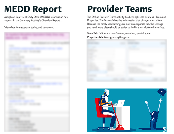
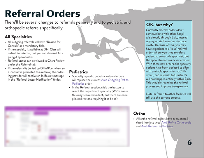
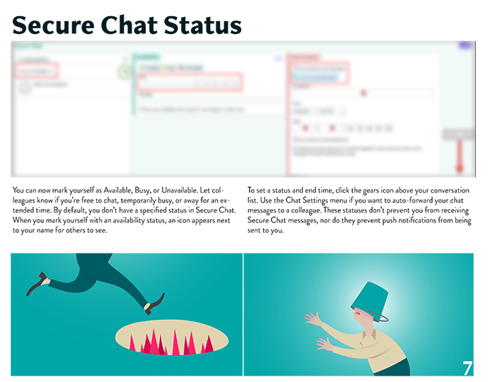
Quarterly Updates
Incredibly Loud and Extremely Clear
background
As an Epic instructional designer, one of my primary responsibilities was to communicate important changes to the software. Besides the smaller, weekly, changes, Epic also had one massive annual update that required months of preparation. To ease the load, Epic switched to smaller quarterly updates, reducing the number of changes each time. Smaller was extremely relative, however, and every few months I’d have between 30 and 100 updates to sort through.
purpose
Any time I needed to communicate with my audience, the challenge was the same: time scarcity and information overload. Inpatient providers (doctors, physician assistants, and nurse practioners) are incredibly busy and receive a torrent of emails every day. The three best ways to reach them were short presentations during department meetings, print materials left in workstations, and emails. Very well-crafted emails. To keep my users’ trust, I needed to ensure the information presented was strictly need to know, written in a clear and engaging fashion, and presented with some visual interest to keep it fun.
Process
At the beginning of every update cycle, Epic would release brief descriptions of all the changes relevant for my user group. My first task was to sift through these and separate them into three categories: wholly unimportant (back end changes, changes to modules we didn’t use, etc.), discoverable (new colors, obvious layout changes, etc.) and possibly worth communicating. Then, I’d take the possibly worth it and discoverable categories and meet with stakeholders such as chief residents and the Chief Medical Information Officer. We’d quickly review the lists, and select the dozen or so most important changes. I’d then take those, create screenshots and write the text, writing and rewriting and rewriting until I was sure it was clear and concise, without losing its humanity. Finally, I’d decide on a theme, create illustrations, and handle layout. The finished product would be used as a visual reference while presenting at meetings, emailed to all inpatient providers, and printed copies would be left throughout the hospital.
Outcome
These documents led to two outcomes I’m equally proud of. First, they effectively communicated important information to my audience. At department meetings, users asked for copies to take with them, and when rounding, I could see that copies I’d left in work areas had been paged through. I received emails from users commenting on their appreciation of the design. Second, I had an effect on how colleagues and other Epic Instructional Designers communicated. A colleague who succeeded me after I left Denver Health made the format her own, but continued the tradition of communicating the most information as clearly as possible with whimsy and visual interest. I also posted the documents to the Epic User Web where users ask questions and share best practices. Educators at hospitals around the country commented positively on the designs and a representative from Epic told me she was going to use them as examples for hospitals starting their own training programs.